Adobe
Rebranding an Icon: Honoring the Past, Inspiring the Future
In 2025, branding and design are central to the success of every major company. For Adobe, they’re absolutely essential. If you create the tools that power the world’s creatives, you have to lead by example.
Refreshing Adobe’s brand was a high-stakes challenge—one that demanded equal parts respect for our heritage and vision for the future.

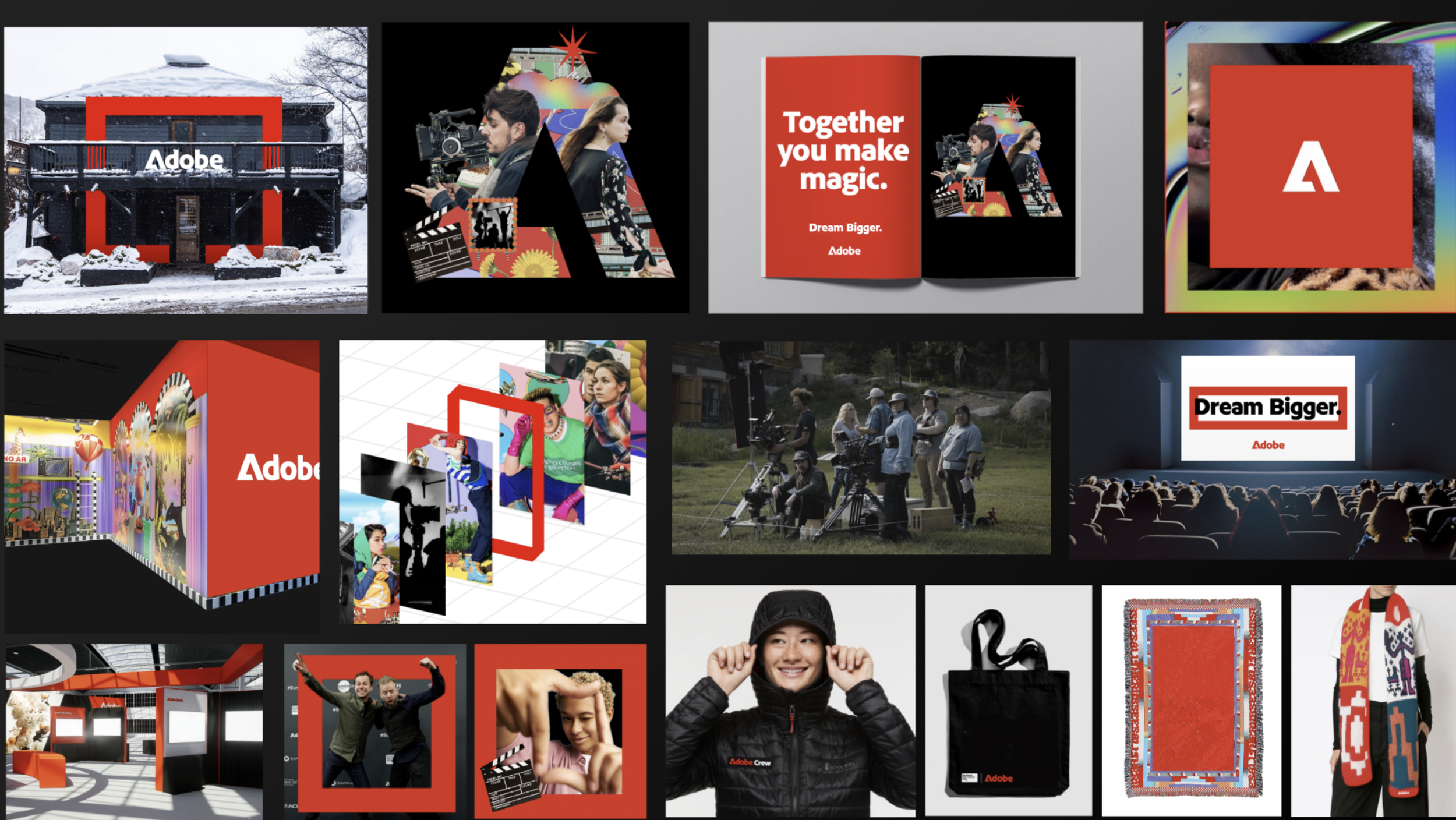
At the center of this evolution is a new logotype that pays tribute to Marva Warnock’s original 1982 design. My aim was to create something fresh yet rooted in our heritage—an identity that nods to the past while confidently looking ahead. By uniting the “A” icon and wordmark into a single, bold expression, we’ve simplified our visual language and built a mark that is clear, strong, and enduring.

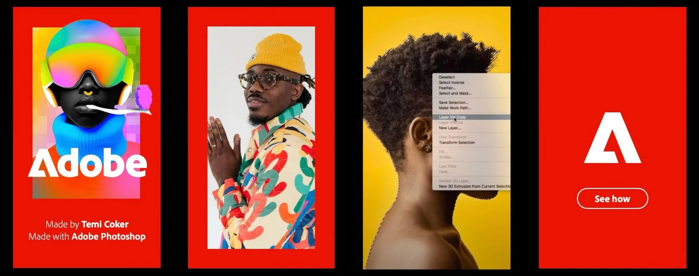
The refresh extends well beyond the logo. We sharpened the palette to black, white, and a revitalized Adobe Red—richer, brighter, and unmistakably ours. We also introduced the Adobe Lens, a unifying frame that highlights imagery and symbolizes Adobe as a portal to creativity and transformation. Its flexibility, with defined states and behaviors, ensures instant recognition across every application of the brand.
Equally important, this evolution strengthens Adobe’s entire ecosystem. We refined product lockups with Adobe Clean Display, a typeface we developed in partnership with our type design team, and built a cohesive UI expression system grounded in Spectrum. With redrawn icons, flexible containers, and unified motion behaviors, the experience now feels consistent, modern, and distinctly Adobe.
What makes me proud is how seamless this transformation feels. The visuals are fresh and forward-looking, yet they resonate with a sense of familiarity—as though they’ve always been there. This isn’t reinvention for reinvention’s sake; it’s a thoughtful realignment. One that honors decades of heritage while preparing Adobe to lead for decades more.
Type / Motion
Experiential
Partnerships
Internal

Campaigns

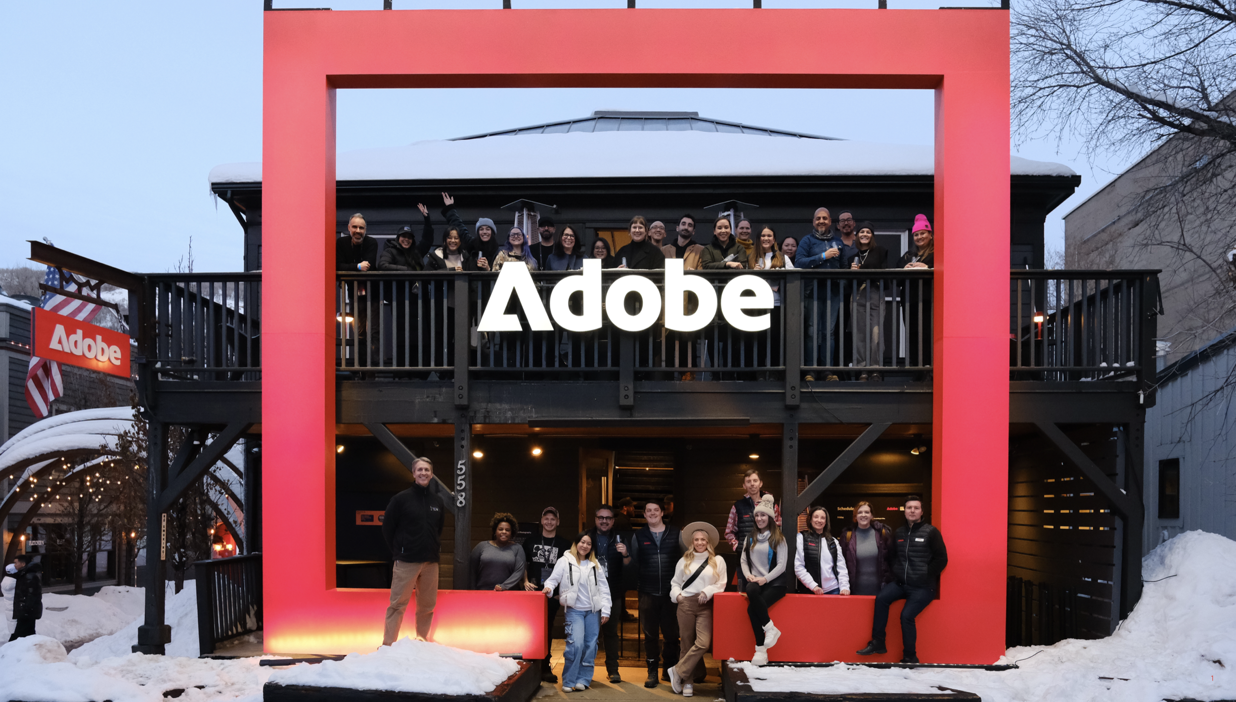
Events